 Notepad

[Android/Kotlin] TabLayout Custom Style - 탭 스타일
Notepad96
·2022. 8. 20. 23:26
1. 요약
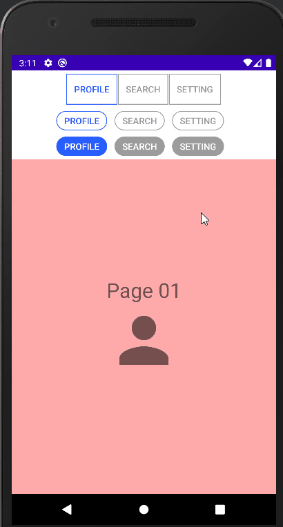
이번 글에서는 TabLayout에서 각 Tab 메뉴의 스타일을 다양하게 정의하고 적용하는 방법에 관하여 기술한다.
기본적으로 TabLayout과 ViewPager2를 이용하여 레이아웃을 구성하는 방법은 아래 이전에 작성하였던 글을 참고하면 된다.
[Android/Kotlin] TabLayout + ViewPager2 - Slide하여 화면 전환
1. 요약 이번 글에서는 TabLayout과 ViewPager2를 사용하여서 Tab 할 수 있는 메뉴가 있으며 이를 클릭하면 화면이 전환되며, 마찬가지로 좌우로 Slide 하였을 시 화면이 전환되도록 구성하는 방법에 관
notepad96.tistory.com
해당 예시에서는 사각형 모양에 박스와 Chip Button 모양처럼 모서리가 둥근 모양을 정의하였으며, 이처럼 모양의 대한 정의는 Drawable 파일을 정의하였으며, 선택 여부에 따라 텍스트나 테두리의 Color를 변경해주기 위해서 Color 파일을 이용하였다.
2. 레이아웃
2-1. drawable 모양 정의
테두리를 사각형 형태로 만들거나 타원 형태로 만들거나 모서리가 둥근 사각형으로 만드는 등 모양을 정의할 수 있다.
● tab_style.xml
아래 코드는 사각형 모양이며 1dp 길이며 menu_select 색의 테두리를 갖는 모양을 정의하는 코드이다.
<?xml version="1.0" encoding="utf-8"?>
<shape xmlns:android="http://schemas.android.com/apk/res/android"
    android:shape="rectangle">
    <stroke android:width="1dp" android:color="@color/menu_select" />
</shape>
● tab_style02.xml
아래 코드는 모서리가 둥근 사각형이며 menu_select 색의 테두리를 갖는 모양을 정의하는 코드이다.
<?xml version="1.0" encoding="utf-8"?>
<shape xmlns:android="http://schemas.android.com/apk/res/android"
    android:shape="rectangle">
    <corners android:radius="40dp" />
    <stroke android:width="1dp" android:color="@color/menu_select" />
</shape>
● tab_style03.xml
아래 코드는 모서리가 둥근 사각형이며 menu_select 색의 배경색을 갖는 모양을 정의하는 코드이다.
<?xml version="1.0" encoding="utf-8"?>
<shape xmlns:android="http://schemas.android.com/apk/res/android"
    android:shape="rectangle">
    <corners android:radius="40dp" />
    <solid android:color="@color/menu_select" />
</shape>
모양을 정의하는 방법에 관해서 자세한 내용은 아래 이전의 작성한 글이 있으니 참고하면 될 것 같다.
[TIP] Android Style Background 꾸미기 - 테두리, 모서리 둥글게 등
Android Background 꾸미기 - 테두리(border) 굵기 지정 및 색 변경, 모서리 (corner) 둥글게 지정 /res/drawable 서 리소스 파일 생성 후 작성 <?xml version="1.0" encoding="utf-8"?> # shape의 shape 속성으..
notepad96.tistory.com
2-2. color 색 정의
상태에 따라 다른 Color을 적용할 수 있도록 하는 Color를 정의하는 파일로서 아래 코드에서는 state_selected = true일 경우 즉, 선택된 상태일 경우 select Color가 적용되며, 그렇지 않을 경우 unselect Color가 적용되도록 만드는 색을 정의할 수 있다.
Color Directory가 없을 경우 "res > New > Android Resource Directory"를 통해서 생성 가능하다.
● menu_select.xml
<?xml version="1.0" encoding="utf-8"?>
<selector xmlns:android="http://schemas.android.com/apk/res/android">
    <item android:color="@color/select" android:state_selected="true" />
    <item android:color="@color/unselect" />
</selector>
● menu_select_reverse.xml
<?xml version="1.0" encoding="utf-8"?>
<selector xmlns:android="http://schemas.android.com/apk/res/android">
    <item android:color="@color/unselect" android:state_selected="true" />
    <item android:color="@color/select" />
</selector>
2-3. activity_main.xml
메인 레이아웃에서는 3개의 TabLayout과 1개의 ViewPager2를 정의하였다.
여기서 3개의 TabLayout은 각각 다른 스타일을 적용하였으며 동일한 ViewPager에 연결시키는 구조로 구성하였다.
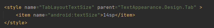
여기서 Indicator(안내 바)를 제거하기 위해서는 tabIndicatorHeight를 0dp로 설정하면 되며 Text Size를 변경하기 위해서는 아래처럼 스타일을 정의하여 tabTextAppearance의 적용해주면 된다.
또한, Tab Item 간에 간격을 부여하기 위해서는 코드에서 추가적인 작업이 필요하다.
<?xml version="1.0" encoding="utf-8"?>
<LinearLayout xmlns:android="http://schemas.android.com/apk/res/android"
    xmlns:app="http://schemas.android.com/apk/res-auto"
    xmlns:tools="http://schemas.android.com/tools"
    android:layout_width="match_parent"
    android:layout_height="match_parent"
    android:orientation="vertical"
    tools:context=".MainActivity">

    <com.google.android.material.tabs.TabLayout
        android:id="@+id/tabLayout01"
        android:layout_width="match_parent"
        android:layout_height="wrap_content"
        android:layout_marginVertical="5dp"

        app:tabGravity="start"
        app:tabBackground="@drawable/tab_style"
        app:tabTextAppearance="@style/TabLayoutTextSize"

        app:tabIconTint="@color/menu_select"
        app:tabTextColor="@color/menu_select"

        app:tabIndicatorHeight="0dp"
        />

    <com.google.android.material.tabs.TabLayout
        android:id="@+id/tabLayout02"
        android:layout_width="match_parent"
        android:layout_height="30dp"
        android:layout_marginVertical="5dp"

        app:tabGravity="start"
        app:tabMode="fixed"
        app:tabBackground="@drawable/tab_style02"
        app:tabTextAppearance="@style/TabLayoutTextSize"

        app:tabTextColor="@color/menu_select"

        app:tabIndicatorHeight="0dp"
        />

    <com.google.android.material.tabs.TabLayout
        android:id="@+id/tabLayout03"
        android:layout_width="match_parent"
        android:layout_height="30dp"
        android:layout_marginVertical="5dp"

        app:tabGravity="start"
        app:tabBackground="@drawable/tab_style03"
        app:tabTextAppearance="@style/TabLayoutTextSize"

        app:tabTextColor="@color/white"

        app:tabIndicatorHeight="0dp"
        />

    <androidx.viewpager2.widget.ViewPager2
        android:id="@+id/viewPager01"
        android:layout_width="match_parent"
        android:layout_height="match_parent"
        android:layout_weight="1"/>

</LinearLayout>
3. 코드 및 설명
3-1. MainActivity.kt
Tab Item 간의 간격을 주기 위해서 setTabItemMargin이라는 함수를 정의하였으며 인수로는 설정하고자 하는 tabLayout과 Margin 값을 받는다.
동작은 tabLayout의 tab들의 LayoutParams 읽어 MarginEnd를 인자로 준 값만큼 부여하도록 동작한다.
이외에 내용은 요약 부분에 있던 이전 글과 동일한 내용이기 때문에 자세한 설명은 생략하도록 하겠다.
package com.notepad96.tablayoutcustomstyle

import android.os.Bundle
import android.view.ViewGroup
import android.widget.LinearLayout
import androidx.appcompat.app.AppCompatActivity
import androidx.viewpager2.widget.ViewPager2
import com.google.android.material.tabs.TabLayout
import com.google.android.material.tabs.TabLayoutMediator
import com.notepad96.tablayoutcustomstyle.databinding.ActivityMainBinding

class MainActivity : AppCompatActivity() {
    private val binding: ActivityMainBinding by lazy { ActivityMainBinding.inflate(layoutInflater) }
    private val tabTextList = listOf("Profile", "Search", "Setting")
    private val tabIconList =
        listOf(R.drawable.icon_profile, R.drawable.icon_search, R.drawable.icon_setting)

    override fun onCreate(savedInstanceState: Bundle?) {
        super.onCreate(savedInstanceState)
        setContentView(binding.root)

        binding.viewPager01.adapter = ViewPagerAdapter(this)

        TabLayoutMediator(binding.tabLayout01, binding.viewPager01) { tab, pos ->
            tab.text = tabTextList[pos]
        }.attach()

        TabLayoutMediator(binding.tabLayout02, binding.viewPager01) { tab, pos ->
            tab.text = tabTextList[pos]
        }.attach()

        TabLayoutMediator(binding.tabLayout03, binding.viewPager01) { tab, pos ->
            tab.text = tabTextList[pos]
        }.attach()

		.....

        // TabLayout Tab 사이 간격 설정
        setTabItemMargin(binding.tabLayout01, 3)
        setTabItemMargin(binding.tabLayout02, 30)
        setTabItemMargin(binding.tabLayout03, 30)

    }

    // TabLayout Tab 사이 간격 부여
    private fun setTabItemMargin(tabLayout: TabLayout, marginEnd: Int = 20) {
        for(i in 0 until 3) {
            val tabs = tabLayout.getChildAt(0) as ViewGroup
            for(i in 0 until tabs.childCount) {
                val tab = tabs.getChildAt(i)
                val lp = tab.layoutParams as LinearLayout.LayoutParams
                lp.marginEnd = marginEnd
                tab.layoutParams = lp
                tabLayout.requestLayout()
            }
        }
    }
}
4. 전체 파일
GitHub - Notepad96/BlogExample02
Contribute to Notepad96/BlogExample02 development by creating an account on GitHub.
github.com
'Android' 카테고리의 다른 글
| [Android/Kotlin] RecyclerView Last Item Check - 리스트 마지막 항목 (0) | 2022.08.24 |
|---|---|
| [Android/Kotlin] DataBinding 데이터 바인딩 (0) | 2022.08.21 |
| [Android/Kotlin] TabLayout + ViewPager2 - Slide하여 화면 전환 (0) | 2022.08.18 |
| [Android/Kotlin] ViewBinding 뷰 오브젝트 접근 (findViewById 대체) (0) | 2022.08.17 |
| [Android/Kotlin] Recyclerview List Animation(리스트 애니메이션) (1) | 2022.08.16 |


